There are two opposing forces at play for the prompts that are shown when the user tries to delete a photo.
For heavy users, prompting too much, and too often, can be irritating. Worse, it could lead to prompt blindness as they start ignoring the prompts and just blindly tap on the continue option, potentially not paying attention to new changes.
For new users, not prompting enough is risky because it can result in data loss if we fail to communicate to the user what is the impact of the action they're taking.
We recently came to know of a case in the second category, where unfortunately our prompts didn't warn enough, and the customer ended up deleting something without realizing it'll get deleted permanently.
In light of this, we have decided to rework our deletion prompts. We felt it'd be a good idea to also publish our choices (it might provide a data point for other products evaluating where in the midst of those two opposing forces to try and be).
Deletion in Ente is more involved than it might seem. There are two distinct actions:
Deletion (where an item is moved to trash, from where it'll be permanently deleted in 30 days).
Remove from album (where an item is only removed from the current album, but it'll stay in the other albums it is a part of).
There is actually a third, "permanent deletion" action that happens if the user goes to trash and deletes items from there, but for the sake of keeping this post focused we'll skip talking about that action here.
There are four contexts in which these actions can be invoked:
- From an individual photo screen
- When deleting an album
- After selecting one or more photos from the timeline ("home view")
- After selecting one or more photos from within an album
Finally, there is a third axis – where is the photo getting deleted from:
- Does the user want to delete the photos from ente?
- Or do they want to delete them from their phone's storage?
- Or do they want to delete them from both places.
To provide options for all points in this 2x4x3 matrix would result in 24 permutations, which is too much complexity. People just want to delete stuff, not get a degree in rocket science. So we try to limit the combinatorial explosion.
Let's go through the permutations that are valid and supported.
Deletion from an individual photo screen
Here, there are two important things: one to ask, and one to convey.
We want to ask the user which of the three places do they want to delete the photo from.
We need to convey to the user that the photo will be deleted from all albums it is a part of.
One important fact to keep in mind is that brevity is not just a stylistic choice, it is a necessary part of the communication. We've found that people's eyes glaze over if they see a big block of text, so it is important to keep the text focused, short, to the point.
Thus, whilst there is always a longer and more explanatory way of writing the message copy, it is sometimes (counter intuitively) counter productive to do so.
That said, too brief can be a problem too, if we don't manage to convey the gist. As usual, we need to strive for a balance.
Coming back to the delete. After quite a bit of deliberation, we've thought of going with this:
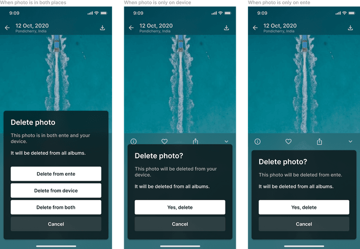
In case you didn't know, our designs are public and you can see the latest, live, versions of these screens here. Tapping on the screenshots will also directly take you to the corresponding Figma node.
Of course, we tried many other iterations, but to keep this post from growing too long we'll only mention the versions we decided to (currently) go with.
That said, let us mention one of the variations. We considered emphasizing on the different prepositions ("in" vs "from" ) to separate the two aspects of the prompt:

The thought being that "in" would refer to the thing we're asking about, and "from" would refer to the separate thing we're conveying. Of course, we don't expect people notice such minor things, but in theory such small differences might help at a subconscious level to separate the two things.
Subconscious or not, it did feel grammatically weird so for now we went with the original phrasing.
There is another aspect to the prompts shown in this screen – if the user is deleting from their device, the OS will then again prompt them at a system level before doing the delete. The behaviour of this differs between iOS and Android (and even within Android versions), so to err on the side of caution currently we prompt ourselves too.
We do wish to improve this in the future, and skip the on-device confirmation prompt from our side when we can determine that the system will subsequently reprompt.
Deletion of an album
When the user deletes an album, the bit we want to emphasize is that any photos (and videos) that are only present in that album will also get deleted. Depending on what the user's frame of mind is - this could either be totally obvious or totally unexpected, so it is perhaps better to reassert that.

Deletion after selecting in timeline
The user can select one or more photos in their home timeline and press the delete action. Since we're not in the context of a particular album in this case, the effective outcome should be if the user had individually gone to each of the selected photos and tried to delete them.
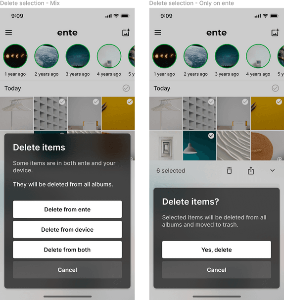
The prompts are not symmetrical to the earlier ones since in this context it is clearer that the photo will be deleted from all albums. So it is less important to highlight that (the problem with highlighting too much is that it reduces the effectiveness of the highlight).
The third case (photos only being on device) isn't possible here since the home timeline contains photos that are already in Ente.
Deletion after selecting in an album
This is the trickiest case because all three axes of choices come head to head here.
The first decision we make is to separate the second axis (delete vs remove from album) into two separate entry points.
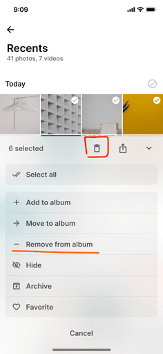
This way, the deletion flow gets isolated, working the same as during the selection from timeline case above.
Unfortunately, this still doesn't fully isolate the remove album flow. First, let us look at the simpler case: if the user selects "Remove from album" and all the items being removed are also present in other places, then there is actually much less at stake, and we have a fairly standard prompt:
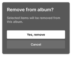
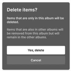
However, things won't always be this simple. In some cases deletion will seep into the remove album scenario. This would happen if the selection includes some items that are exclusively present only in this album. Such items would actually get deleted!
This is risky – the user selected a "Remove from album" option, but the effect might be that some items get deleted.
We have two choices here:
- Either we stop showing the "Remove from album" option in such cases;
- Or create a prompt that tries to warn about this.
The issue with option 1 (not showing the remove from album option in case the selection contains one or more items that are exclusive to this album) is that it then we need to figure out how to convey to the user why some selections have the remove option whilst others don't.
That's not all - we could even tackle this and come up with a solution; but there is a functional issue at play too: this is a fairly common workflow that we'll end up restricting. It is a common requirement to remove photos from albums, including deleting the ones that are exclusive to that album. Not giving the option seems like a disservice.
So for now we decided to attempt option #2, and tried to create a prompt that informs the user that some of the items in their selection might, in fact, get deleted.
We hope this overview of our UX choices was useful to you. There is always the feeling that we've overcomplicated things, that there is a simpler UX possible, so we are sure this is not the last word on these things, and we will continue to iteratively improve these prompts even further.
If the screenshots and choices in this post get out of date, you can always find the latest version of these screen in our Figma file: